WCAG 2.2: what the standard requires
Overview
Web Content Accessibility Guidelines 2.2 is a W3C Recommendation published by the Accessibility Guidelines Working Group. It solves a precise interoperability problem: web content is rendered by browsers, assistive technologies, operating-system accessibility APIs, input devices, and user settings that do not share one application model. WCAG 2.2 defines testable outcomes for content so that these systems can expose the same information and operations to people with visual, auditory, physical, speech, cognitive, language, learning, and neurological disabilities.
WCAG 2.2 is not an implementation manual for a particular browser or framework. It is a conformance standard organized under four principles: perceivable, operable, understandable, and robust. The current 2.2 Recommendation extends WCAG 2.1 and WCAG 2.0, adds success criteria for focus visibility, dragging, target size, help placement, redundant entry, and authentication, and removes Success Criterion 4.1.1 Parsing because modern user agents no longer depend on the older parsing failure conditions in the same way. WCAG 3 exists only as a draft line of work and does not replace WCAG 2.2 as a W3C Recommendation.
How it works
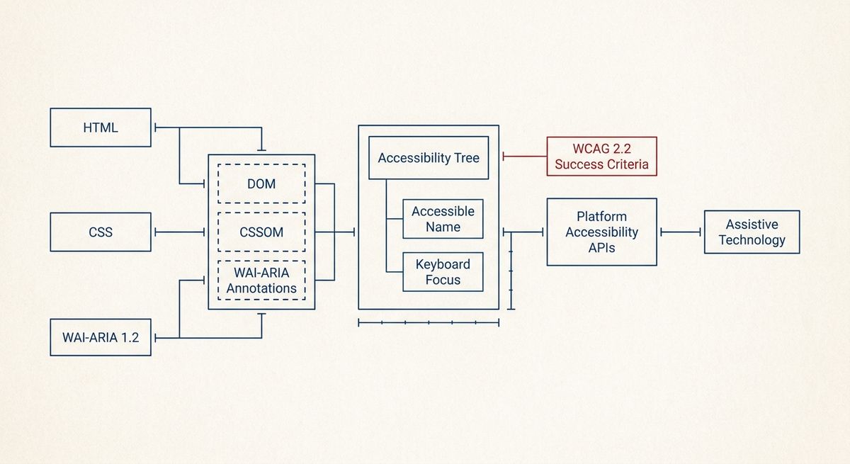
At the systems level, WCAG 2.2 works by constraining the contract between authored content and the user agent. HTML defines elements, states, form controls, focus behavior, landmarks, and text alternatives. CSS defines visual rendering, media queries, and layout effects. WAI-ARIA 1.2 defines roles, states, and properties for cases where native semantics are insufficient. The Accessible Name and Description Computation specification defines how labels are computed. Browser engines combine DOM, CSSOM, native semantics, and ARIA into an accessibility tree that is exposed through platform accessibility APIs.
A conforming page therefore has to preserve both visual and programmatic meaning. A button must be operable by keyboard, but it also must have a computed role, name, and state that assistive technology can announce. A modal dialog must not merely appear above the page; focus must move predictably, background content must not remain in the active navigation sequence, and the dialog must have an accessible name. For dynamic interfaces, status changes have to be exposed without forcing focus movement, commonly through ARIA live regions where native HTML does not already provide the behavior.
WCAG 2.2 also treats interaction sequences as systems, not isolated screens. Its conformance requirements cover full pages and complete processes, so a checkout-like or account-like flow cannot conform if one required step fails. The standard also requires that technologies be used in accessibility-supported ways, meaning the relied-on features must work with user agents and assistive technologies. A conforming alternate version is allowed only when it provides the same information and functionality and can be reached through an accessible mechanism.
What the standard says
The normative core is the set of success criteria and conformance requirements in WCAG 2.2. Level A is the minimum conformance level, Level AA adds requirements commonly used in public policy and procurement references, and Level AAA is the highest level but is not expected to be satisfied for all content. The conformance model requires that all Level A criteria be satisfied for Level A conformance; Level AA requires all Level A and Level AA criteria; Level AAA requires all three levels. It also requires non-interference: non-conforming content must not block use of the rest of the page for specified criteria such as keyboard access, flashing, and pause/stop/hide.
Several documented thresholds are exact. Success Criterion 1.4.3 requires contrast of at least 4.5:1 for normal text and 3:1 for large-scale text, with defined exceptions. Success Criterion 1.4.11 requires at least 3:1 contrast for visual information needed to identify user-interface components and graphical objects. Success Criterion 1.4.10 requires reflow without loss of information or functionality at 320 CSS pixels width for vertically scrolling content and 256 CSS pixels height for horizontally scrolling content, except for content requiring two-dimensional layout. Success Criterion 2.3.1 prohibits content that flashes more than three times in any one-second period unless it is below the general flash and red flash thresholds.
The new WCAG 2.2 criteria add practical constraints for modern interfaces. Success Criterion 2.4.11 Focus Not Obscured (Minimum), at Level AA, requires that a focused component not be entirely hidden by author-created content. Success Criterion 2.4.13 Focus Appearance, at Level AAA, defines minimum focus indicator area and 3:1 contrast requirements. Success Criterion 2.5.7 requires an alternative to dragging movements unless dragging is essential or determined by the user agent. Success Criterion 2.5.8 sets a Level AA pointer target size threshold of at least 24 by 24 CSS pixels, with documented exceptions. Success Criterion 3.3.8 requires authentication that does not depend on a cognitive function test unless a permitted alternative or mechanism is provided.
Trade-offs
The measurable trade-offs mostly arise from space, timing, and state management. Larger pointer targets consume layout area; the WCAG 2.2 Level AA threshold is 24 by 24 CSS pixels, while the older Level AAA Success Criterion 2.5.5 threshold remains 44 by 44 CSS pixels. Meeting reflow at 320 CSS pixels often forces navigation, tables, and toolbars to collapse or scroll in constrained ways. These are not aesthetic preferences in the standard; they are measurable constraints on pointer accuracy, zoom, and viewport adaptation.
Contrast thresholds can alter color systems because the required ratios are computed from relative luminance, not perceived brand harmony or screen brightness. Text that passes at one font size may fail at another because 1.4.3 uses different thresholds for normal and large-scale text. Focus indicators introduce another trade-off: a highly customized outline can pass only if it remains visible, is not obscured, and meets the applicable geometry and contrast requirements. Removing the browser’s default outline without an equivalent replacement is usually a regression.
Authentication and data-entry criteria trade convenience for error resistance and cognitive accessibility. Success Criterion 3.3.7 Redundant Entry requires previously entered information in the same process either to be auto-populated or available for selection, unless re-entry is essential, required for security, or the information is no longer valid. That can require state persistence across steps. The measurable effect is not a performance benchmark but a reduction in repeated input demands under a defined process boundary.
Failure modes
Common failures occur when visual state and programmatic state diverge. A custom control may look like a checkbox but expose no checkbox role, no checked state, or no keyboard interaction. An icon-only button may have no accessible name because the accessible-name computation finds only decorative SVG. A validation message may appear visually but not be associated with the control by label, description, or error semantics. Diagnosis starts by checking the accessibility tree, computed name, role, value, focus order, and keyboard operation, not only the pixels on the screen.
Another frequent failure is focus loss or focus obstruction. Sticky headers, cookie banners, and fixed toolbars can cover the active element, creating failures under the WCAG 2.2 focus criteria. Single-page applications can replace a route without moving focus to the new heading or main region, leaving keyboard and screen-reader users in stale context. These defects are diagnosed by tabbing through the page, observing document.activeElement, checking bounding boxes with getBoundingClientRect(), and verifying whether author-created overlays obscure the focused component.
Automated testing can identify many deterministic failures, such as missing form labels, invalid ARIA references, absent document language, insufficient static contrast, or missing alternative text. It cannot fully determine whether alternative text is meaningful, whether reading order preserves meaning, whether a process is complete, or whether instructions are understandable. A correct diagnosis combines machine checks with keyboard-only operation, zoom and reflow checks, contrast calculation, screen-reader inspection where relevant, and mapping each issue to a specific success criterion rather than to a vague accessibility category.
A minimal implementation
A correct minimal implementation starts with native semantics. Use the HTML Standard’s interactive elements for links, buttons, inputs, selects, textareas, details, summaries, headings, lists, tables, and landmarks before adding ARIA. Provide a valid document language with the lang attribute, a descriptive title element, one logical main region, ordered headings, visible labels for form controls, programmatic label associations, and text alternatives for informative images. Decorative images should be ignored with empty alt text or equivalent semantics so they do not add noise.
Keyboard operation must reach every function in a meaningful order, with no keyboard trap and with a visible focus indicator. Pointer targets should meet the WCAG 2.2 24 by 24 CSS pixel Level AA requirement or one of its documented exceptions. Content should reflow at the documented viewport sizes, preserve text spacing without loss of information, avoid drag-only operation, and avoid authentication steps that depend solely on memorization, transcription, puzzles, or calculations. Errors should be identified in text, associated with the relevant fields, and accompanied by suggestions when known.
For dynamic content, use native elements where possible and add ARIA only to communicate state that native HTML cannot express. A modal dialog should have an accessible name, move focus into the dialog when opened, keep keyboard focus within the active dialog while it is modal, and restore focus predictably when closed. Status messages should be exposed programmatically without unnecessary focus changes. The minimal test set is direct: keyboard pass, accessible-name pass, contrast pass, reflow pass, form-error pass, focus-not-obscured pass, and complete-process pass against the WCAG 2.2 success criteria.